INTRODUCTION
ATTENTION CATCHER
Welcome to a beginner’s guide on the visual weight elements in photography. When we look at interesting photos, there are always some parts that will capture our attention. That “something” is called the visual weight, and when mastered, will turn people into actual photo ninjas.
Yes, there are several elements that will affect visual weight, and how we shift those elements around in the frame will result in better photos. Just what are these elements? How do we create winning shots? Let us walk through all of them in this guide – Read on to find out!
WHAT IS VISUAL WEIGHT?
In design, visual weight is the notion that design elements have varied weights; that is, some objects, even on a two-dimensional medium, can appear to be heavier than others.
In layman terms, when we look at photos, our attention will naturally go straight to that one “hero” subject that stands out the most. Then we will move our attention to the “sidekicks”, and finally, the lesser details.
That is visual weight in photography, and it is the measure of what attracts our eyes the most. I.E. Whatever that sticks out the most in a photo has the most visual weight, whatever that is not appealing has little visual weight.
Easy? Let us now go through the visual weight elements and how to play with them to get good photos.
1) COLORS

Humans react differently to various colors. The more striking and vibrant the color is, the more it will stand out to the human eye. But that said, a photo full of striking colors will look as if a unicorn had bad diarrhea instead.
Therefore, balance is still the key and the muted colors have their place in the game as well; It is best to include reasonable use of various colors to make the photo stand out, not a puke of rainbow colors.
2) LINES
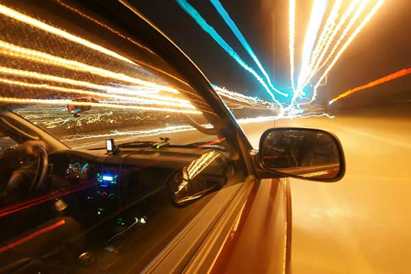
Lines are one of the basics of composition – Straight lines, curved lines, arcs, and zig-zag. Depending on how you place the lines, they can make very powerful compositions. There are countless ways to use lines in photos, but here are a few examples:
- All the lines pointing in one direction.
- Lines leading to an interesting subject.
- Forming artistic patterns with a series of lines.
- Adding depth with diagonal and/or arcs.
But of course, there are nearly endless ways to work with lines, and I will leave a link to more tutorials below.
3) SHAPES

Shapes are another basic composition element, with the basics being circles, rectangles, squares, and triangles. We can make a photo stand out depending on how the shapes are being composed. A few examples being:
- Negative shapes, as above, using other objects and subjects to create shapes.
- Using architecture to create repeated shapes and patterns, for example, windows on a skyscraper.
- Using triangularly shaped subjects to act as a visual lead, for example, a railroad leading towards the sunset.
Again, there are nearly endless ways to play with shapes, and I shall leave some links to more tutorials below.
4) CONTRAST
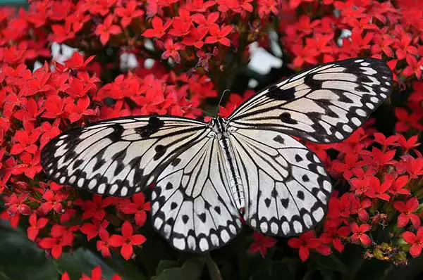
Contrast is the stark difference between two or more clashing elements. For example, a bright colored subject against a dull-colored background, or speck of dark color in a sea of bright colors. It is not just restricted to colors, and contrast will work its magic as long as we can find clashing elements:
- Size – Big and small shapes.
- Lines – Straight and curved lines.
- Tones – Bright and dark.
- Texture – Rough and smooth.
- Shapes – Irregular and geometric.
- Lines – Straight and jagged.
5) QUANTITY & PATTERNS
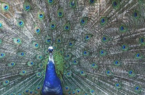
One small feather may not have a lot of impact on a photo, but when we repeat that and add a ton of feathers, the visual weight will start to build up. Why is that so? That is because human brains are actually very good at picking out repeated things and establishing patterns.
But of course, a random mass of feathers is not going to be as visually appealing. It is when we arrange and build a pattern around to it that the magic starts to work. That could be an arrangement of all feathers pointing in one direction, or fanning out from the center; This same tactic can be applied to pretty much anything – Arranging a box of clips, pins, color pencils, and more.
Patterns don’t necessarily have to be manually created either way, and they can found everywhere in nature. The patterns on leaves, flowers, fruits, tree trunks, and so much more. Just keep your eyes peeled, and there are plenty of patterns just lying around.
6) SIZE
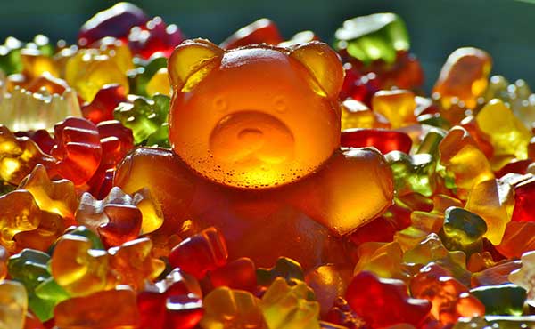
The bigger the subject, the more visual weight it has. By big, I don’t mean that the subject has to be physically big, but it is the amount of space that we give a subject in the frame – The more frame space a subject occupies, the more attention it will get. We can also combine the usage of size with contrast, lines, and/or shapes to boost the composition:
- Colors – A big subject that has vibrant colors.
- Lines – Everything is pointing towards the big subject.
- Contrast – A big subject that stands out among smaller ones.
- Shapes – Everything else is round, but the big subject is a bear.
7) SPACE & ISOLATION

Following up from the previous element, positive space is the area where the big subject occupies. The surrounding area that does not get as much attention is called the negative space; To make the big subject pop out, we gave it a lot of positive space.
But it also works the other way round – We can assign a lot of negative space, but leave only a small area for the main subject. This negative space forms isolation and forces people to pay more attention to the subject instead. As above, a very classic example of isolation is the lone balloon in the sky.
8) DEPTH OF FIELD
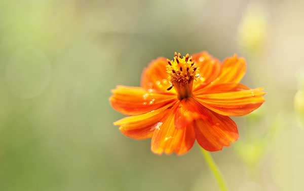
Photos are 2 dimensional, that is what some people say. But what if there is a third dimension to photos? Yes, I am referring to the depth-of-field. The plane that is in-focus within the frame and everything outside this plane are blurred.
- Consider an image with a deep depth-of-field – Everything is in focus, and people are going to pay attention to both the foreground plus background. The visual weights will be balanced throughout.
- But when it comes to a shallow depth-of-field, we will get a blurred background. The visual weight will now shift towards the in-focus subject instead.
So yes, using a shallow depth of field is kind of like isolating the subject from the background.
9) ORIENTATION
Some beginners will probably start to think of orientation as either “portrait or landscape”. Well, that is partially correct, but orientation is much more than those two – How about a 15 degrees roll? 35 degrees? How about tilting the camera upwards and downwards? Orientation is exactly how we position the scene and our camera.
Sometimes, a simple tilt to the frame can add more dynamic feels to it… Or even destroy it with strange slanted horizons. The more creative way I have seen folks play with orientation is to create “upside down anti-gravity” photos – Take a photo that is upright, then rotate it with Photoshop to give a false impression that people are floating mid-air.
10) CONTEXT/STORY/MESSAGE

This is one of the more interesting visual weight elements, as it has a “deeper meaning” than the rest. Literally, a picture speaks a thousand words. If the photo conveys a strong message or triggers strong emotions, then you have done it right.
I have a confession to make, I am bad at creating storyboards. 😐 But a good example of using context as visual weight could be a photo of a child holding a gun – Which surely is controversial and will surely trigger some reactions. Maybe provoke some thoughts on violence and why children even have access to such weapons.
11) POSITION & BALANCE

As for this final element, it should not be a surprise – How we place the subjects in the frame, is how we balance the frame. Citing from Smashing Magazine guide, there are 4 ways we can use to balance out the subject placements:
- Symmetrical Balance: Like a reflection in the mirror, whatever we have on one side of the frame, we must have an equal on the other.
- Asymmetrical Balance: Unlike symmetrical balance, we can use different subjects to balance, but they must have an almost equal visual weight.
- Radial Balance: When the subjects radiate from a common core. Much like the sun and sunlight rays.
- Mosiac Balance: Order with chaos. There are many subjects, but they are equally spaced out within the frame.
LINKS & REFERENCES
That’s it for the visual weight elements, and here are a couple of links that may be useful to you.
- 6 Pro Tips For Effective Use Of Color In Photography – Photography Pro
- How to Use Leading Lines to Improve Your Photography Composition – Expert Photography
- Visual Design: Using Shape in Photography – Digital Photo Secrets
- How to Create Balance in Photographs with Visual Weight – SLRLounge
- Understanding Balance and Visual Weight in Photography – Photography Mad
CLOSING
NOT JUST ABOUT BALANCE

Thank you for reading, and we have come to the end of this guide. I hope that it has helped you to better understand visual weight, but to follow up a bit more on the last point, visual weight is not all about balance.
There are times where we can deliberately tip the scales to create an unbalanced photo, to create a photo that is striking with the imbalance. For example, a photo that is busy with patterns on one side, and empty on the other.
Personally, I do think that there is a huge difference between “visually balanced” and “visually striking”. Everyone has their own style, so go find your own definition of “visually exciting”. Only time and experimenting with various components can help you perfect your style. Good luck and happy shooting!