INTRODUCTION
COLORS, THE ANCIENT STUDY
Welcome to a chapter on how to use colors in photography to create compelling photos. The study of colors go way back into the ancient days, and our ancestors know well to paint murals with various colors to create what is known as art today.
Thankfully, the research that our ancestors have done can easily be implemented into photos as well – This chapter will walk you through a couple of ways that you can use colors to spice up your photos. Read on.
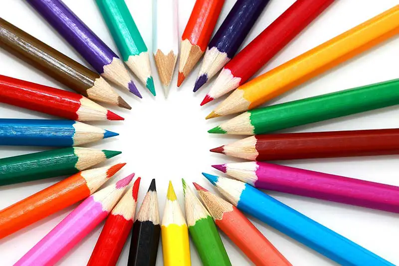
1) STRIKING COLORS
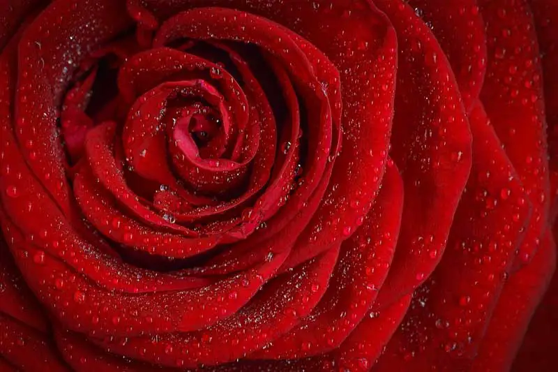
How to use: Include a good amount of punchy, contrasty, rich colors in your photo – Red, orange, yellow, and lime are among the “usual suspects” of strong striking colors. Do be careful that overly pushing the saturation with editing software such as Photoshop will not help to achieve this effect.
Try using a circular polarizer instead, which will usually give you a richer and deeper tone of color. Then, further enrich the colors in editing by pushing the blacks, whites, contrast, and saturation.
How it helps: Strong colors create a bold photo. If you want a photo that attracts a lot of attention, this is one of your best bets.
2) SUBTLE/MUTED COLORS
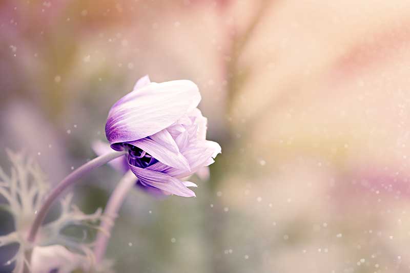
How to use: This is the complete opposite of striking colors. Instead of going with the bold colors, go for the more subtle shades and pastel colors – White, pink, violet, and cream. Contrary to using bold colors, desaturation in Photoshop actually does help to achieve this feel. But the key to getting a subtle colored photo is still a good eye and the use of soft lighting (try shooting on a cloudy day).
How it helps: If bold is not your style, then go for the opposite. Photography is not all about using the “heroic” colors, subtle colors themselves carry a different vibe of softness and gentleness.
3) ONE COLOR TO RULE THEM ALL
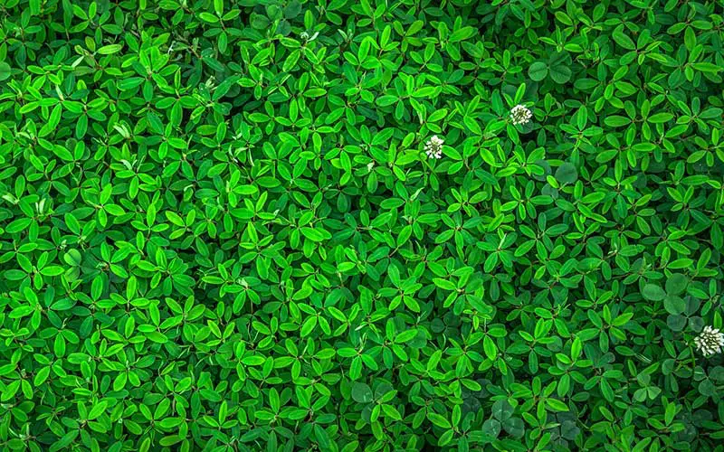
How to use: Include one single tone of color to fill up nearly the entire frame. The idea to use only one single shade of color is easy, but how you make it interesting is not – I am pretty sure that a random shot of “everything grass” or “patch of sand” is not interesting. You need to boost the composition by choosing a striking color, and even more by using subjects with similar patterns and/or textures.
How it helps: When it comes to photography, some people will often think that the subjects are the products, people, objects, and/or landscape – They are missing out on the fact that color is also a subject. Letting a single color dominate the entire frame is also one way to put emphasis on color.
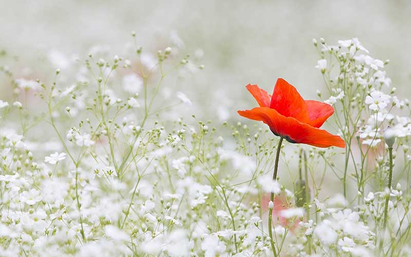
4) COLOR CONTRAST
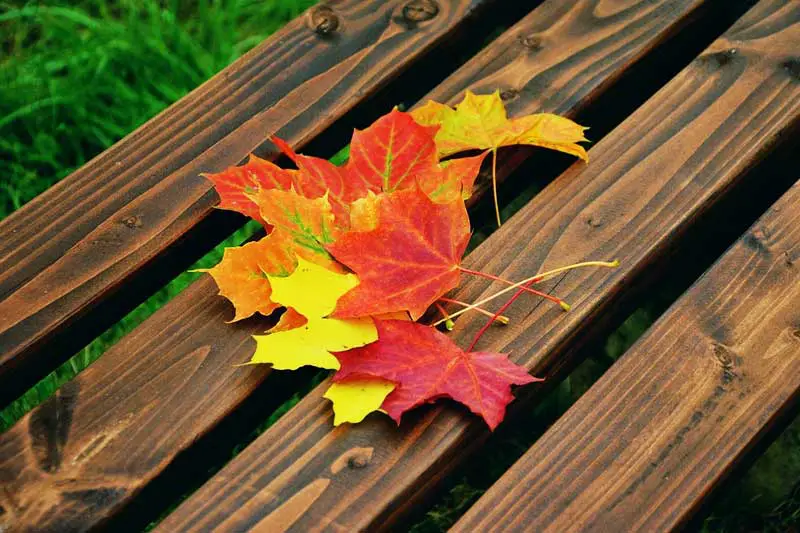
How to use: Choose a background that is mostly one single tone of color, then include an odd colored subject that stands out; A single spot of bright color against a dull background, or the other way round. But please take note, the subject must still occupy sufficient space within the frame.
How it helps: Do you know what a highlighter pen does? Yep, it works almost exactly the same way in photography – An odd color within a sea of monotone is bound to stick out like a sore thumb. Use this to your advantage, to bring attention to that subject you want to stand out.
5) COMPLIMENTING COLORS
How to use: Include colors that compliment each other well. For example, red and brown, green and blue, blue and purple. Of course, your choice of subjects and composition skills still matter.
How it helps: Well, it’s kind of a captain obvious thing. A mix of colors that work well together with each other will create a flow and harmony.
6) COLORS PARTY
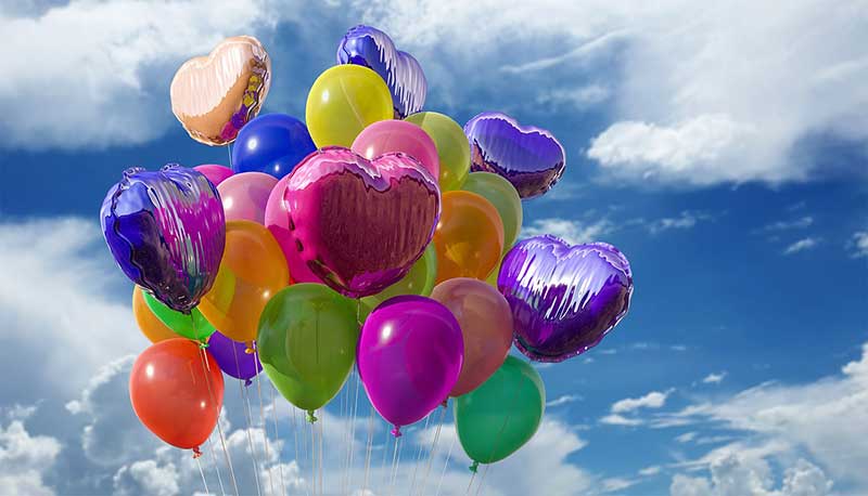
How to use: Adopt a splash of many different colors in your photo. Be careful not to over-saturate when you edit the photo though. It may look simple, but most newbies end up with “a vomit of colors” this way.
How it helps: Personally, this is kind of a double edged sword to me. A mix of many different colors can either produce a thrilling photo or a mess out of it… You decide.
7) USE COLORS TO TRIGGER EMOTIONS
In the long study of colors, smart monkeys have discovered that each different color represents a different meaning, and triggers a different emotion. We call that color psychology, and it is not easy to explain in a few words. But in general:
- Red represents power, love, and passion.
- Green represents life, safety, and nature.
- Blue represents calmness and serenity.
- Yellow represents happiness and joy.
- Purple represents authority and power.
- Black conveys mystery and elegance.
- White conveys purity and innocence.
There is a whole load more you can read on Wikipedia, but the point of color psychology is to take advantage of the color meanings for photography. For example, you will want to use more reds in a shot about love, and green is good for stuff like natural health products and/or food.
EXTRA) COLOR WHEEL
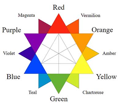
How do we know if colors are clashing or complementing each other? Thankfully, a lot of research has been done over the centuries, and we have something called the “color wheel” to refer to. There are many different versions of it, but in general:
- Opposing colors in the wheel will clash with each other. For example, red will clash with green and yellow will clash with purple.
- Complimenting colors will be beside each other. For example, Red and orange will compliment each other.
Visit Wikipedia if you wish to read more.
CLOSING
GO SHOOT
We have come to the end of this guide, and I hope that it has given you some ideas on how to use colors in your photos. But reading will only provide knowledge, and actually putting it into practice helps you to gain experience. So go try some of the color combinations out, and have fun!